What if the colours you choose could shape not just a space, but the way people feel the moment they step into it? In 2026, colour continues to do exactly that. It sets the mood, builds connection, and tells a story long before a customer reaches for a product. This year’s palette leans into warmth, depth, and a quiet sense of belonging, offering retailers fresh ways to create interiors that feel both grounded and expressive.
Earthy Foundations and Warm Neutrals
Comfort remains king in 2026. Rich terracotta, ochre, raw umber, tobacco brown, and sunbaked clay continue to rise, offering retailers a grounded foundation for furniture, cabinetry, and textiles. Warm neutrals like mocha, caramel, and soft beige are gradually replacing cooler greys, creating interiors that feel inviting from the moment you step inside. These shades sit beautifully alongside natural materials, bringing an effortless harmony to displays.
Retailer tip: Build these tones into your buying across upholstery, accessories, and ceramics. Layer textures to keep the look modern, familiar, and quietly luxurious.
 Deep Reds, Plums, and Dusty Pinks
The appetite for expressive colour hasn’t gone anywhere. Deep burgundy, aubergine, and plum bring a moodier, more intimate character to collections, while dusty pinks and berry tones soften the edges. Together, they create a palette that’s dramatic yet comforting, ideal for bedrooms, dining spaces, and standout living-room pieces.
Retailer tip: Position these colours as your showstoppers. Velvet chairs, sculptural vases, or statement headboards work brilliantly, especially when paired with warm metallics or understated neutrals.
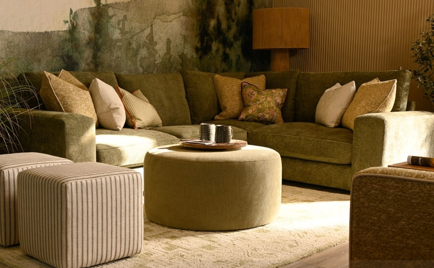
Herbal Greens and Olive Tones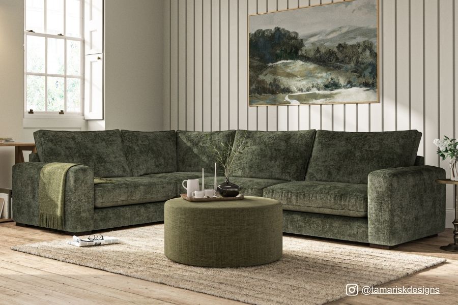
Greens step into a new role next year, acting as sophisticated neutrals rather than bold accents. Moss, laurel, olive, and fresh herbal tones lend a sense of calm and connection to nature. They’re versatile and work across cabinetry, walls, and soft furnishings, making them a reliable choice for both contemporary and heritage-inspired interiors.
Retailer tip: Stock a spectrum of greens to help customers build cohesive, nature-led schemes. They blend seamlessly with the earthy palette emerging for 2026.
 Atmospheric Blues and Misty Greens
Blues evolve with a softer touch. Atmospheric blues, seafoam, and misty greens offer a grounded tranquillity that suits bedrooms, bathrooms, and statement furniture. These shades bring emotional balance to a space, acting as a serene backdrop rather than a bold statement.
Retailer tip: Use these colours in displays where you want to convey calm and clarity. They also create a strong foundation for seasonal updates.
Daring Darks and Unexpected Pairings
For those craving edge, saturated darks remain key. Navy, charcoal, and midnight tones add structure and sophistication, particularly in cabinetry and upholstery. What sets 2026 apart is the move toward unexpected pairings: satin periwinkle with velvet chocolate, chartreuse gloss with baby blue matte, or tangerine softened by metallic moss. These combinations heighten emotion and make interiors feel personal and expressive.
Retailer tip: Introduce high-contrast pairings in curated zones. Dark foundations allow brighter accents to shine without overwhelming the space.
Trending This Month: What Retailers Are Leaning Into
- Earthy Tones: Terracotta, ochre, and tobacco brown remain firm favourites across accessories and accent pieces.
- Deep Reds and Plums: Burgundy and aubergine are gaining momentum for standout products.
- Herbal Greens: Moss, laurel, and olive continue to shape calm, connected interiors.
- Atmospheric Blues: Seafoam and misty greens bring a refreshing twist to bedroom and bathroom buys.
- Unexpected Pairings: High-contrast colour stories are emerging fast in decorative accessories and giftware.
Key Moves for Retailers and Buyers in 2026
-
Layer for depth: Build displays with multi-dimensional tones like warm eucalyptus, divine damson, blue aura, and sensorial brown to create inviting, immersive moments.
-
Refresh hero pieces: Lean into bold reds and smoky jades to give sofas, headboards, and standout shelving instant impact.
-
Back the “feelgood” shades: Use mint greens, buttery ambers, and denim blues across accessories to spark quick, optimistic updates.
-
Mix in the unexpected: Add chartreuse, electric fuchsia, or playful pairings like pastel blue with amber to attract trend-led shoppers.
-
Update the neutrals: Move beyond beige with clay, warm khaki, and lived-in browns, lifted by touches of graphite or berry.
Colour in 2026 is expressive, warm, and intentional, giving every retailer room to tell a story that feels current and deeply personal.
Want to See These Trends First-Hand?
Join us at the January Furniture Show, taking place in the epic NEC Birmingham on 18 - 21 January 2026. Meet the brands behind the colours, explore new collections up close, and get inspired by what’s shaping interiors right now.
See it. Touch it. Curate it.